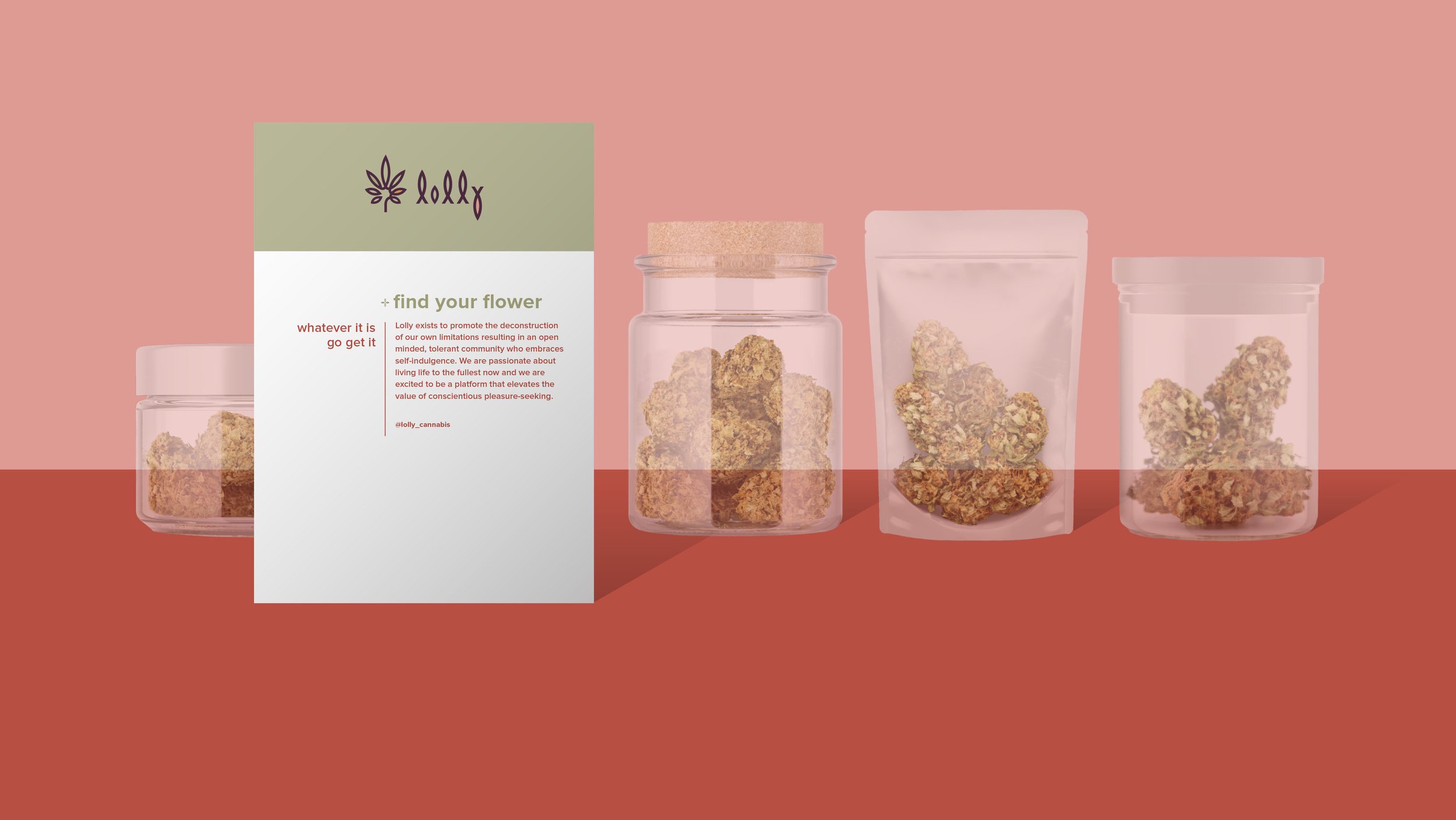
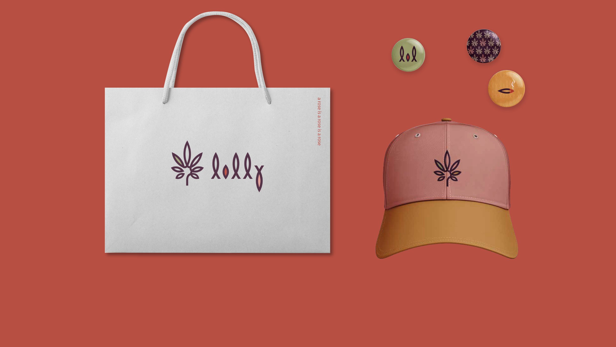
Visual identity for Cannabis Retail Store.
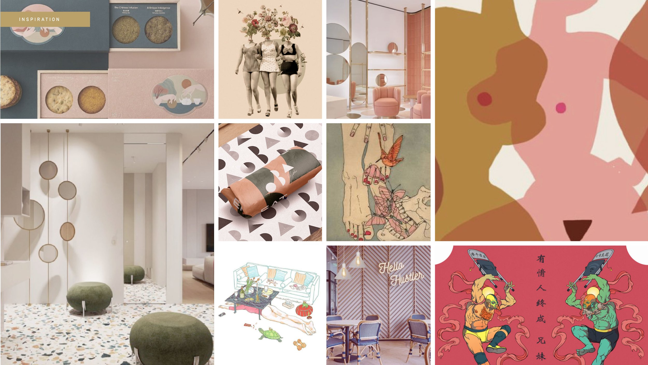
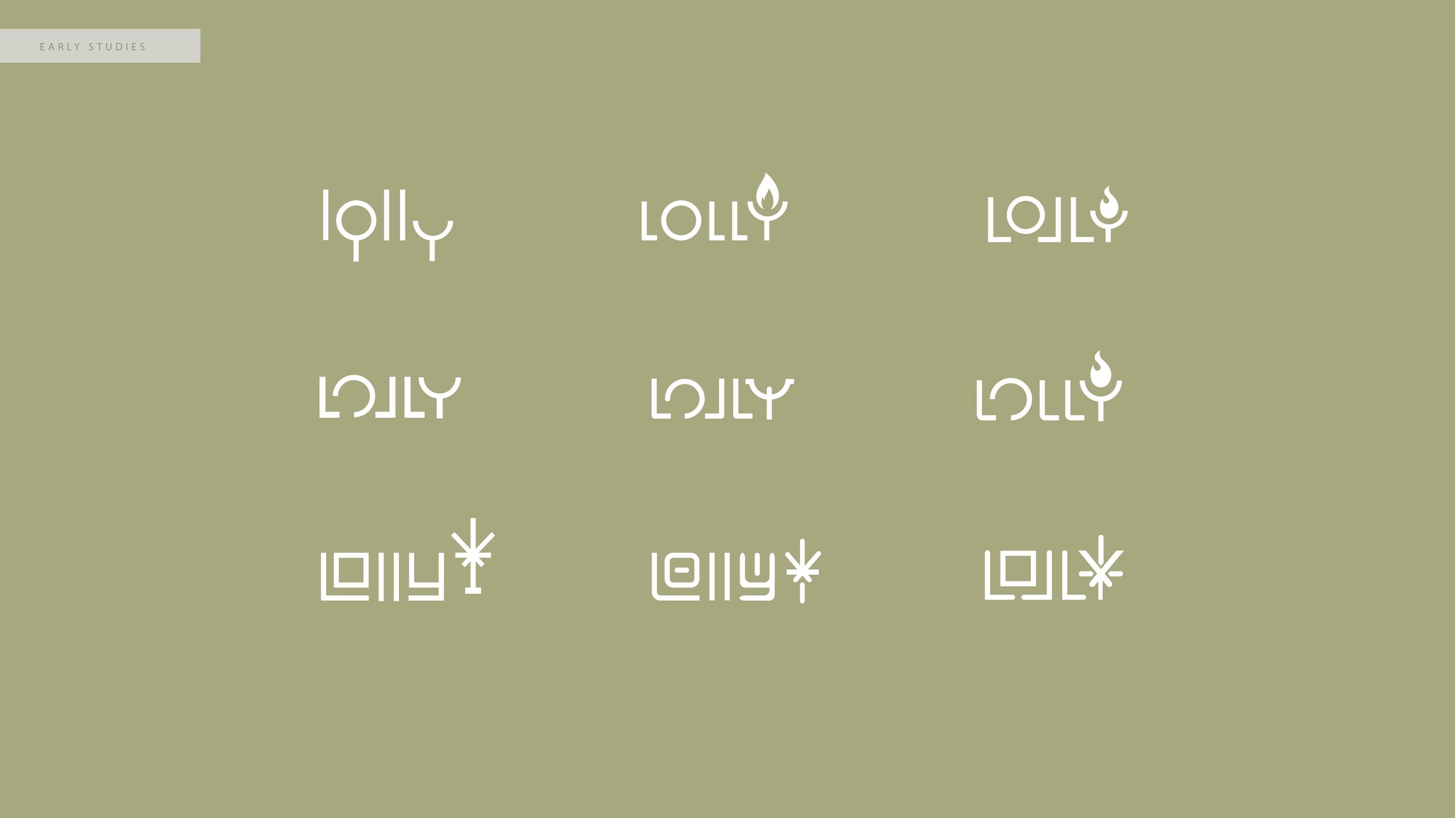
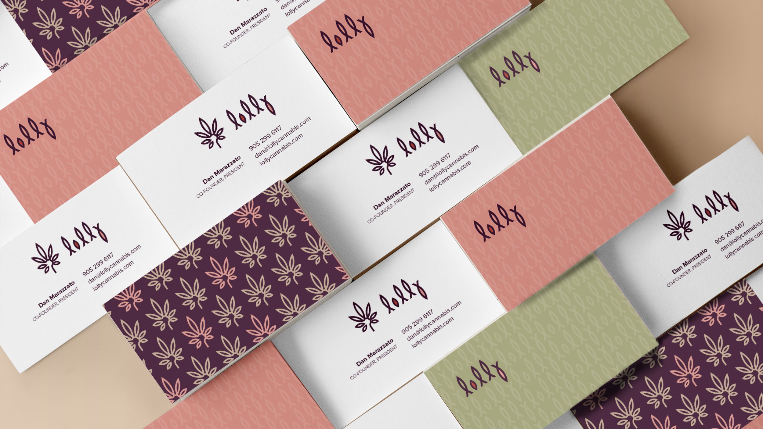
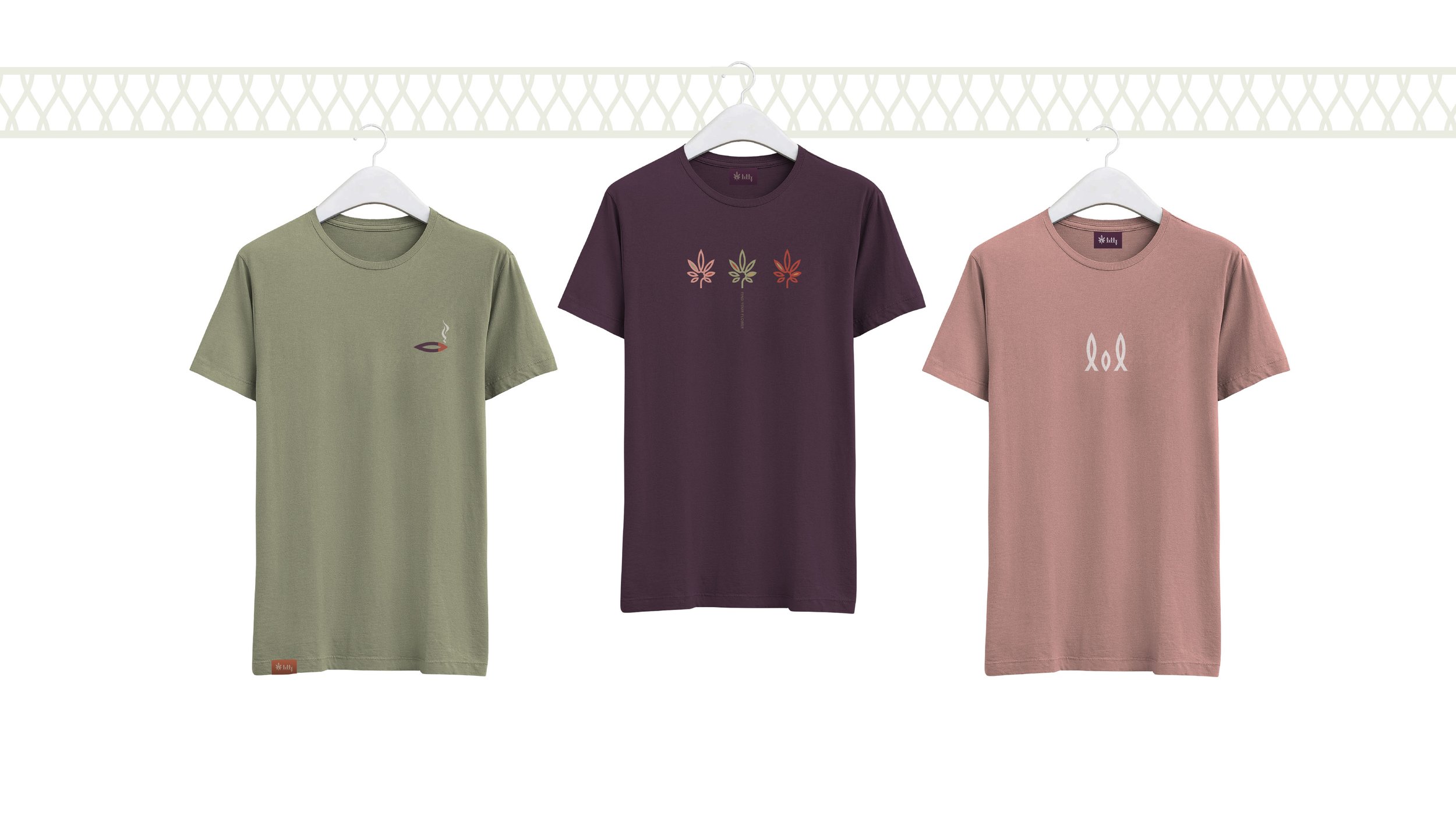
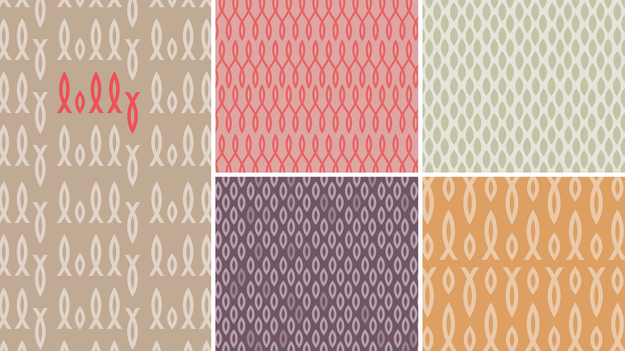
The form of the logo began in cursive with the loops, pattern and rhythm informing a more graphic approach. The beauty of it is it's simplicity. The logo is reduced to a single shape that is reflected, rotated and scaled. Likewise, hedonism and femininity were inspirations for the project which are also reflected in the basic forms. To avoid the letterform resembling a religious symbol, the stress of the letterforms are through the center and the bowl of the letterform is created in perfect symmetry using the golden ratio. The colour palette is inspired by botanical drawings, south-western colour palettes, and earth-tones, all personal preferences of the client but on strategy and therefore on brand.
Designed at Overdrive Design Ltd.
Creative Director: James Wilson
Designer: Courtney Zoeller
Client: Lolly Cannabis
Year: 2020
Scope: Brand Identity + Brand Extension
Lolly Cannabis

